
Medicare Sales Seminar Tool
A case study
Goals
-
Because of the complexity of Medicare, Aetna brokers regularly hold marketing seminars for Medicare enrollees. It is essential to create an efficient way of signing up our customers to attend these meetings.
-
Goal was to create a user-friendly, responsive web application tied to SalesForce designed to help seniors find a convenient Medicare seminar.

Research: Competitive Analysis
Here are the categories that we investigated:
-
Navigation & Site Structure
-
Is the site easy to navigate with clear menus and links?
-
Are important pages (e.g., sign-up, contact, FAQs) easy to find?
-
Is the site structure intuitive for first-time or older users?
-
-
Sign-Up Process
-
How many steps are in the sign-up flow?
-
Is the form easy to complete (clear labels, large inputs, simple fields)?
-
Are there helpful error messages or guidance if something goes wrong?
-
-
Content Clarity & Readability
-
Is the language simple and easy to understand (aimed at 6th–8th grade reading level)?
-
Are there definitions or explanations for complex Medicare terms?
-
Is the content broken into short paragraphs or bullet points?
-
-
Visual Design & Branding
-
Is the visual design modern, clean, and appropriate for a senior audience?
-
Are colors, fonts, and layout consistent and aligned with trust and professionalism?
-
Does it feel cluttered or calming?
-
-
Mobile Experience
-
Is the website responsive and easy to use on phones and tablets?
-
Does the sign-up process work well on mobile?
-
-
Trust & Credibility
-
Are there clear privacy policies and security notices near the form?
-
Does the site include recognizable brand elements, accreditations, or testimonials?
-
Are contact options clearly visible and trustworthy?
-
-
Support & Help Options
-
Is it easy to reach a real person (e.g., phone number, live chat)?
-
Are there help links or tooltips during sign-up?
-
Is there support for multiple languages?
-
-
Calls to Action & Motivation
-
Are the CTAs clear, compelling, and placed logically?
-
Are users encouraged to act now (e.g., “Reserve your spot”)?
-
Are the benefits of attending a seminar made obvious?
-

"Medicare can be complicated and confusing. I need one-on-one advice!"
Aetna Medicare customer
Aetna Medicare Personas
-
Prior to any design sessions, we consulted the current Aetna Medicare customer personas.
-
The product team decided to focus primarily on two of our personas, the Willful Endurer and the Balanced Seeker.
-
These would inform our brainstorming sessions later.


Brainstorming Sessions
-
We held several brainstorming sessions where we focused on the user goals and the business goals of the new application. We used MIRO as our collaboration platform.
-
We included a diverse group of attendees, including product managers, Medicare SMEs, UX designers, and developers.
-
We divided the development into priority features that we had to have as well as future enhancements.

Christopher did a great job organizing and running the session. He invited a diverse group and made sure all of their voices were heard.
Aetna Ui Designer
Mid-fidelity Wireframes
-
Once we settled on the basic screen flow we moved on to more detailed Wire frames that included more accurate text.
-
These want through several iterations before we created the final designs in Figma.

User Flow
-
While we were creating the wire frames, we also created user flow diagrams.
-
This work was then shared with the team and changes were made.
-
At this point, we also engaged the Accessibility team to review our work and make any suggestions.

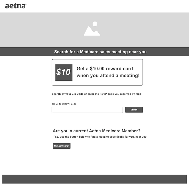
Round 1 Designs
-
Following discussions, we created high-fidelity mockups.
-
As always, we started with a mobile-first approach. Over 25% of Medicare users use their mobile devices for exploring the internet and transacting business.
-
Colors, type, and images were based upon existing Medicare Marketing branding. The type style and colors were intended to portray a relaxed, caring feel.
-
We used Aetna's signature purple and pink for call to action, and white and grey for secondary elements.
-
We used a serif font for our h1, which added warmth and a personal, human touch—appropriate for a senior audience. The body text and buttons use a clean sans-serif font, ensuring readability and clarity.
-
The image, taken in our photo studio, brought some warmth and personalization.
-
Our goal was to make seniors comfortable and confident about choosing a Medicare seminar.
-
We used a "card" approach to organize the information and insure ease of use. This was an approach used by other Aetna sites at the time.


Figma Prototyping Steps
-
I started by importing high-fidelity mobile designs into Figma once UI mockups were approved (mobile-first approach).
-
The flows depended on what we wanted to test with users and what KPI's we wanted to verify. We wanted to identify any possible friction in our interface
-
Created frames for each major screen (landing page, eligibility funnel, seminar listing, RSVP form, confirmation, etc.).
-
Organized the artboards logically (grouped by flow) so the team could visually follow the journey.
-
Defined entry points / starting frames for different user paths (e.g. “Prospective member,” “Existing member”)
-
Added click / tap interactions connecting buttons, links, navigational elements to their target frames
-
Created transitions to create smooth visual changes (e.g. expanding panels, changing states)
-
Built overlays / modals for popups (help tips, disclaimers) using the “Open Overlay” interaction
-
Incorporated component variants (e.g. button default / hover / pressed) to prototype interactive UI states
-
Simulated branching logic—e.g., asking “Who are you?” and routing to different paths based on that response
-
Used Figma variables in combination with components to show and hide sections of the application to help simplify the flow.
-
Kept consistency with navigation patterns (back, home, next) across flows to reduce confusion. Utilized sections to simplify the Figma flow.
-
Tested the prototype internally, iterated on interactions (timing, transitions) before user testing
-
Linked to the prototype from usertesting.com
Prototype Testing
-
Following prototype creation process and the development of a testing script, we tested our it with five subjects using the UserTesting application in a moderated study.
-
We wanted to focus on if seniors could understand the concept of these meetings and easily navigate the process of signing up. adding a friend, finding a convenient location, and canceling their RSVP.
-
I moderated the testing and responses were recorded. I also asked my peers to sit in and take notes when possible.
-
The results were recorded in Microsoft Excel.
-
In order to speed up the process, the data was then collected in MIRO and I invited team members to respond to the results and decide on solutions to the most significant user items.
-
Over-all the response was positive, but there were indications that we needed to make a few adjustments.

Final Design
Following testing, we made the following changes to our design:
-
Less text on a page and more white space to avoid visual clutter and cognitive overload.
-
Less blocky layout. Don't trap all of the elements in containers. Reduce the shadows on the cards to reduce weight. The design was seen as heavy handed and out-of-date.
-
Strive for a cleaner less complex design that makes it easier for users to move from one piece of information to another with low cognitive stress.
-
More information about Medicare Seminars to give seniors confidence to move forward and sign up.
-
We found that members would often sign up for a seminar that was meant for prospective members. To remove this confusion we added a screen that asked them who they were and then funneled them to the proper location.
-
To simplify the design and make it less distracting, we largely removed the pink color.

Conclusion
-
After we settled on the design, We then created a prototype in Figma. Following this, we tested our prototype with five subjects using the User Testing application in an unmoderated study.
-
Over-all the response was positive, but there were indications that we needed to make a few adjustments.